One system. Multiple products and brands.
LivaNova, Multi-brand Design System
Team



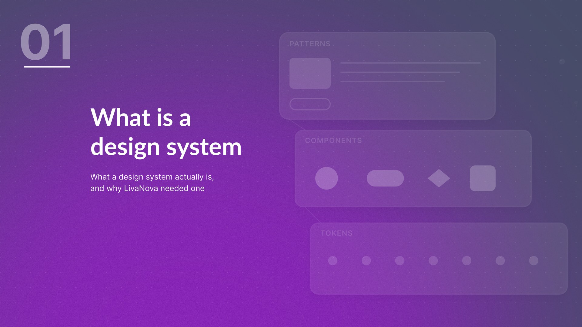
The opportunity
Building every product independently meant rebuilding the same problem each time: components recreated from scratch, interaction patterns drifting apart, and accessibility handled inconsistently from team to team. As the number of products and brands grew, that duplication became more expensive to maintain than to fix.
One core. Multiple brands.
We separated what needed to stay consistent everywhere from what a brand should be free to change. A global Design System sits underneath every product. Brand and product systems sit on top of it, inheriting shared foundations rather than rebuilding them.
Designing the rules
Early on, brand requests kept arriving as one-off exceptions: a slightly smaller tap target here, a different focus state there. Each felt reasonable on its own, but together they made every accessibility guarantee conditional. So we defined, once, what a brand is allowed to change and what stays protected, and new requests get checked against that line rather than negotiated fresh each time.
- Colour palettes, provided tokens meet accessibility requirements
- Typography identity, within defined legibility rules
- Component styling
- Icon style
- Brand tone
- Visual language
- Permitted motion styling
- Accessibility minimums
- Interaction behaviour
- Minimum tap targets
- Contrast requirements
- Semantic structure and screen-reader behaviour
- Scaling requirements
- Error handling structure and core component behaviour
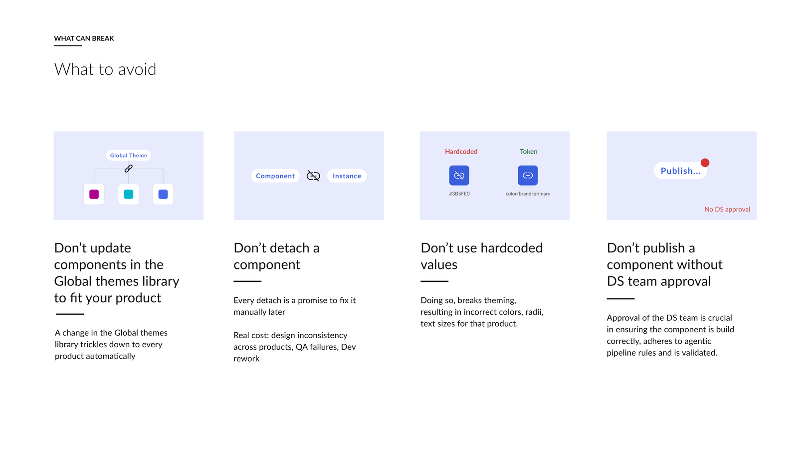
Apply the correct modes (scoping and theming) to every screen. This ensures the correct colours, sizes and styles are applied to the product.
Edit the component, not the instance. A change in the component is what trickles down. Editing the instance overwrites it on the next update.
If something is missing from the library, flag it. Tell a DS designer and build out as many details as necessary, rather than filling the gap with a local workaround.
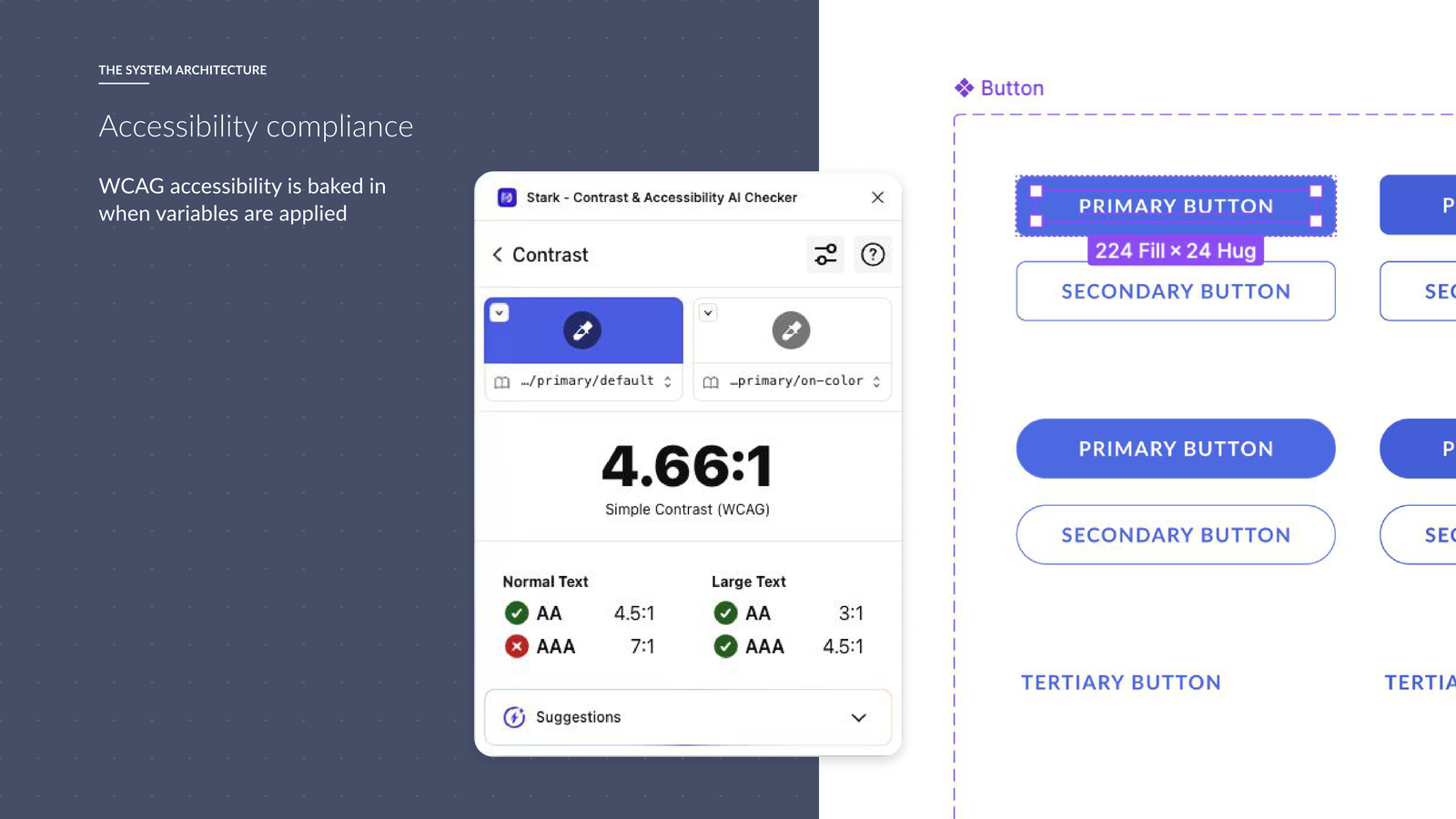
Accessibility built into the system
Our patients can be affected by motor, visual, cognitive and dexterity challenges, sometimes in the middle of or recovering from a seizure. I created our accessibility strategy and built WCAG 2.2 AA requirements into component acceptance criteria and our Definition of Done, so accessibility is designed in rather than checked at the end.
Content design works the same way. Our patient-first Tone of Voice principles, clear, calm, actionable and reassuringly expert, sit alongside visual design, interaction behaviour and component architecture as another system-level guardrail. Confusing language increases cognitive load for people who are tired, anxious or medicated.
A system needs governance
The system is maintained, not finished. We run a weekly Design System session to review blockers, stress-test components, and agree which product needs should become system patterns rather than one-off exceptions. It's also where we groom our Confluence backlog and resolve gaps between what's designed and what's been built.
The system is a product, not a library.
Some of the visuals on this page are from an internal "Design System in Practice" walkthrough presented by Iro Mavrogeni, one of the two Design System designers I work with.
From Figma to frontend
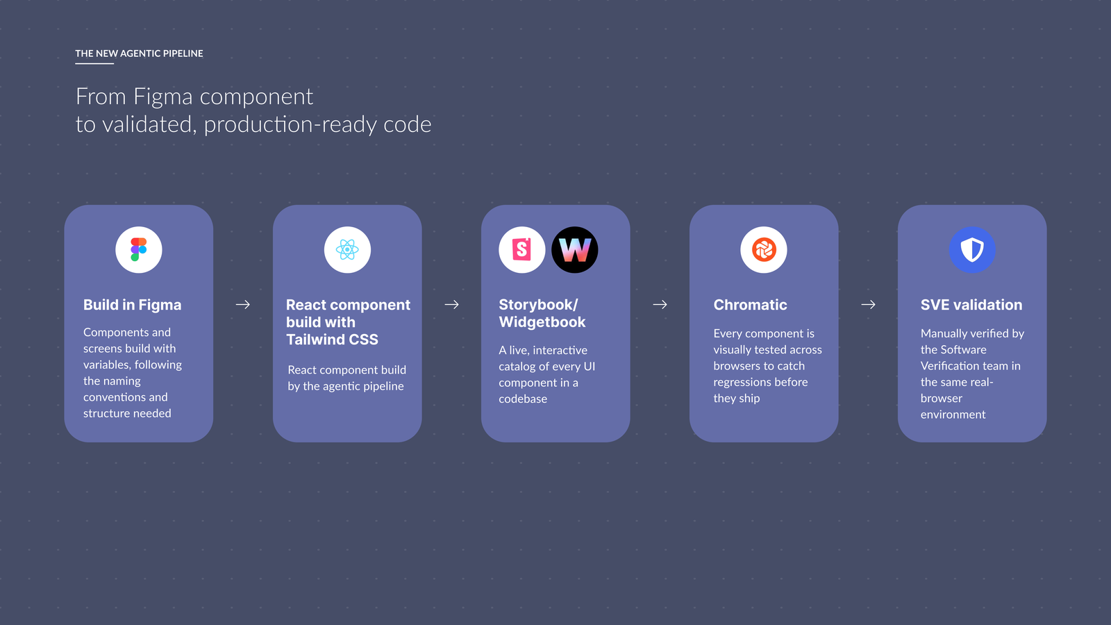
Our Figma libraries and Storybook implementation used to drift apart the moment either one changed. The design team is now responsible for frontend-ready components as well as Figma components, so the platform team can build directly from what we produce.
Designing the system for AI
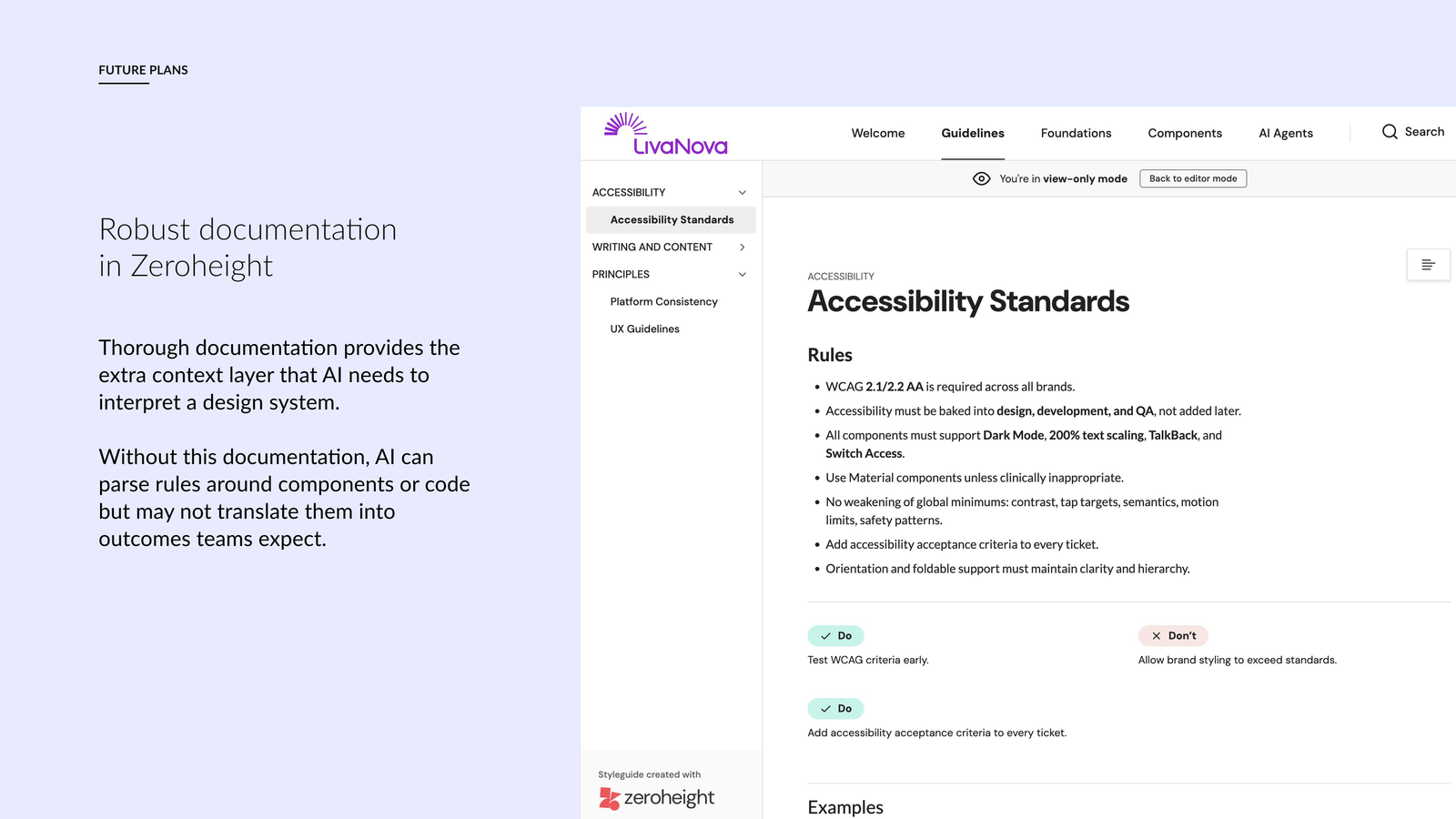
We're using Claude Code to move the Design System further towards a design-to-code workflow: generating frontend components, maintaining and transforming tokens, testing component changes, and catching inconsistencies faster than doing it by hand.
The Design System still does the important work. It gives Claude Code the rules, tokens and accessibility guardrails it needs to produce something consistent, rather than the other way round. Our direction is to encode more of those rules so AI can work reliably inside them.
What we've changed
A year in, adoption is real and measurable: 11,037 component insertions from one R&D team alone, across 4 product themes, with the first component now through the full agentic pipeline end to end. Industry research on 24 global design leaders puts the cost of not having a system at up to 40% of design and dev time lost reinventing existing patterns.
- One global system supporting two products today, with more brands in the pipeline
- Shared foundations instead of rebuilding components for every product
- Brand identity separated from core interaction behaviour
- Accessibility requirements embedded into reusable components, not checked at the end
- Figma and Storybook brought into the same component model
- A repeatable governance process instead of a finished library
- The design team contributing further into frontend implementation
- Early foundations for AI-assisted component creation and maintenance
Where we're taking it
In order, here's what the system needs to do next:
Help new products launch faster.
Support more brands without duplicating core UI.
Make future brand changes significantly easier.
Close the gap between design and production code.
Encode accessibility and UX guardrails once, instead of solving them per product.
Use AI to take on lower-value implementation and maintenance work inside those guardrails.
The goal isn't to make every product look the same. It's to stop every product solving the same problems again.